How to Choose Paint Colors: From Fixed Finishes to Samples
How to choose paint colors in order: start with what stays, pick light or dark, link rooms, set trim and sheen, sample two or three, then size the gallons.
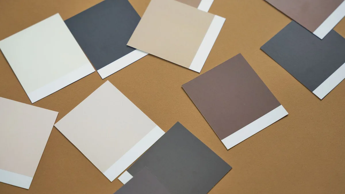
You are standing at a fan deck of a hundred nearly identical beiges, and the chip that looked right under the store lights is the one that looks wrong at home. One maker’s sampling guide says a chip seen in the aisle can’t show how the paint will look on all four walls at various times of the day, and the same goes for a color you saw in someone else’s house. Below are the decisions in the order that keeps the choice small: what stays, how light or dark, how rooms connect, the trim, ceiling and sheen, which two or three colors to test beside them, and how many gallons to buy once you have chosen.
The short answer
| Step | What you decide | What the makers’ guides say |
|---|---|---|
| 1. What stays | Warm, cool or neutral, from the floor, tile, cabinets and fabric you keep | One maker says to start from a favorite rug, art or fabric and from permanent features; Benjamin Moore says to weigh existing furniture, flooring, cabinets and counters |
| 2. Family and strength | The color family, and how light or dark | One maker’s tips: light tones and off-whites can make areas seem more spacious, deep tones more dramatic; another suggests warm families for social rooms, cooler ones for private rooms |
| 3. Room to room | Which rooms share a family and which carry the accent | Benjamin Moore’s whole-house page: a dominant color, a few secondary colors, a trim color and an accent |
| 4. Trim, ceiling, sheen | One trim color, a ceiling lighter than the walls, a sheen per surface | One maker’s open-concept guide; Benjamin Moore’s sheen chart |
| 5. Sample | Two or three colors beside the trim, big patches, up to a couple of days | Sampling guides from three makers; samples cost $3 to $6.95 here (price for reference only) |
| 6. Gallons | Wall area, two coats, primer only where the change is big | Glidden’s calculator: one gallon typically covers up to 400 sq ft; Clare’s range is 375 to 425 sq ft |
What is staying, and what color is it already?
List what is not changing: the floor, counters, tile, cabinets, a brick fireplace, the sofa and rug, the trim if you are keeping it (our suggestion). One maker’s color-choice guide suggests starting from a favorite rug, piece of art or fabric, since those are often favorites because they carry colors you like, and treating permanent features such as cabinets, tile or a brick fireplace as part of the choice: if your kitchen cabinets have a red undertone, the wall color has to work with that hue. Benjamin Moore’s whole-house page starts in the same place, with existing furniture, flooring, cabinets and countertops, and then asks whether a warm or cool undertone suits the room given the direction it faces and how much natural and artificial light it gets.
To read an undertone, one maker’s undertone explainer says warm colors typically have orange, yellow or red undertones and cool colors green, blue or purple ones, and that the undertone shows when you put a color next to a pure example of that color. If you do not want to analyze it that closely, it suggests deciding whether the color looks warm or cool to you. For each fixed item, write down warm, cool or neutral (our suggestion); that list is the brief for everything below. Floors are worked through in our best colors for living room guide and tile in the best bathroom colors guide.
Which color family, and how light or dark?
For the family, the same color-choice guide suggests thinking about how the room is used: warm colors in the yellow and red families for social spaces such as dining rooms, kitchens and other living spaces, and cooler blues, greens and neutrals for private ones such as bedrooms, bathrooms and home offices. Treat that as a starting point, since your step 1 list may already rule some families out (our reading).
On strength, on one maker’s color tips, light tones and off-whites can make areas seem more spacious and cheerful, and dark colors and deep tones make areas more dramatic. Another maker’s guide says lighter colors can make a small space feel more open and dark colors can make surfaces appear closer, giving vast rooms a more intimate feel. A risk worth testing for is going too light: one of the five sampling mistakes on a third maker’s list is being afraid of the dark, and it says most beautiful grays are in the middle or dark ends of the chip, while very pale gray paint colors can look a lot like a dingy white once on the wall.
Benjamin Moore prints a color’s light reflectance value (LRV) under Color Information on its color pages, for example 88.95 for Cotton Balls. What the number means, and how window direction changes it, is covered in our best bedroom colors guide, so here it is enough to use it as a sorting key when you compare two candidates (our suggestion).
How should colors work from room to room?
If you see one room from another, decide them together. Benjamin Moore’s whole-house page builds a palette from a dominant color in the central room, then a few secondary colors for the connected spaces, a trim color and an accent, and says an ideal whole-house palette has six or seven hues in all. For the secondary colors it lists three routes: a shared undertone, an analogous scheme, or a monochromatic look in a few shades of the same color.
Other makers’ pages give shortcuts. One maker’s color-choice guide suggests picking various shades from one color palette to unify rooms, using a neutral as a palette cleanser in rooms or hallways next to bold colors, and putting one neutral on all trim and doors. A paint maker’s accent-color guide says its chips list recommended coordinating colors on the back, and puts the room as 60% main color, 30% main accent and 10% secondary accent, with a note to play with the ratios. In its bedroom example the main color is on the walls, ceiling and bedding, so the ratio counts everything in the room, not only paint (our reading). Benjamin Moore’s page gives the same 60-30-10 split for adding an accent color.
On a floor plan (our suggestion), mark which rooms you see from each other and give each of those groups one family and one trim color. The living room guide above treats open plans at more length.
What about trim, ceiling and sheen?
Choose these before you sample, because they change how the wall color reads, and the samples should be judged with them. On one maker’s color tips, trim in the wall color is the trendier look and can make a room look bigger, light trim accents the walls, a dark trim is for the bold, and using one trim color throughout the house unites the rooms. Benjamin Moore says off-white paint colors are the most common for trim, and to sample your trim choices too. For the ceiling, one maker’s open-concept guide says lighter than the walls makes it feel higher, and a darker one can make large areas feel cozier.
For sheen, Benjamin Moore’s chart of common uses lists flat for ceilings and walls in low-traffic spaces, matte for walls, living rooms, dining rooms and bedrooms, eggshell for high-traffic walls and those same rooms, and semi-gloss for trim, doors, cabinets and wainscoting. Its page says sheen can affect how colors appear. Benjamin Moore’s 8 oz samples (next section) are eggshell, so if you will go matte the finished wall will reflect a little less light than the patch (our reading). If one of your candidates is a white, our best white paint for interior walls guide compares six, and the room guides above cover the other shades.
How do you narrow to two or three colors and test them?
- Start from chips. Benjamin Moore’s sampling tips say to hold a chip up against the wall rather than look down at it, with a white piece of paper behind it so the existing wall color does not sway it, and that display chips are free at its stores.
- Keep two or three (our suggestion on the number). Even within very similar chips, the undertone can make a big difference on a wall, and a maker’s sampling guide suggests trying a few varieties of the one or two colors you like.
- Make the patch big. That guide says not to paint a 5-inch swatch and expect the full effect: cover as much area as you reasonably can, then do a second coat.
- Put it where the light differs, next to what stays and next to your trim (our suggestion): the window wall, the darkest wall, beside the floor you are keeping, with a trim candidate (a painted board or a peel-and-stick sample) held against each wall patch. Benjamin Moore suggests a white foam core board so you can move the color around the room through the day, and a peel-and-stick sample you can wrap around a corner to see the color in light and in shadow at once.
- Let it dry, then wait. The sampling guide from step 2 says to let samples dry completely, as some colors look much different dry than wet. Another maker’s color tips say dry paint always looks darker than wet paint and suggest leaving samples up for a couple of days and looking at them through the day. After dark, look once under your own lamps (our suggestion).
- Decide last, with everything in view: the color that still looks right beside the floor, tile or fabric you listed in the first section and beside its trim candidate.
This is the one step where you buy something. Three ways to sample, each with the price the maker’s page showed:
- Benjamin Moore 8 oz Paint Color Sample, $5.99 (price for reference only). A jar of eggshell paint that covers about 2 by 2 feet in two coats. The maker says liquid samples are for testing color only, not for finishing a wall.
- Benjamin Moore Peel & Stick sample, $6.95 (price for reference only). A 9 by 14.75 inch sheet made by Samplize with Benjamin Moore paint, reusable and sold online only. It is the one to move from wall to wall.
- Clare peel-and-stick swatch, $3 (price for reference only). Its Fresh Kicks white page lists a $3 swatch of that one color, in eggshell.
Three samples cost $17.97 as jars, $20.85 as peel-and-stick sheets or $9 as three Clare swatches at the Fresh Kicks page’s $3, before shipping and tax, against $77.00 for one gallon of Clare wall paint (price for reference only) (our arithmetic; different makers, so compare the order of magnitude, not the pennies).
How much paint should you buy, and is primer needed?
Work out the wall area first. Take a 12 by 12 foot room with 8 foot ceilings: four walls make 48 feet around, so 384 square feet before doors and windows (our arithmetic). Glidden’s paint calculator says one gallon typically covers up to 400 sq ft on primed, smooth, non-porous surfaces and that drastic color changes or porous surfaces may need more than one coat; Clare’s estimator gives 375 to 425 sq ft per gallon of paint and subtracts doors and windows. Two coats on that room is 768 square feet, which is 1.9 gallons at 400 and 2.05 at 375 (our arithmetic), so two gallons is a tight fit and a calculator run with your real doors and windows is worth doing. If several rooms get the same color, Benjamin Moore’s paint calculator says to add up their square footage.
Primer is for the big changes. One maker’s prep guide says walls in good condition with a similar color need none, and that a drastic color change, a bright clean color or patch work calls for a primer on the first coat. Its how-to-paint guide adds that over a dark color it is best to prime first, and that darker colors often need more than two coats. Sherwin-Williams’ order-of-painting page calls priming essential for new walls or when switching from dark to light, and says to start with the ceiling, to avoid drips on freshly painted walls. Clare’s primer covers 225 to 275 sq ft per gallon, so one coat on the 384 square foot room is about 1.4 to 1.7 gallons (our arithmetic).
Where these numbers come from
Prices are from the Benjamin Moore sample pages and the Clare color page, read on 15 November 2026 without a discount code. Coverage, primer, sampling and sheen lines are from the makers’ own guides and calculators linked above. The sample totals, the 12 by 12 foot room and the gallon counts are our own arithmetic.
Frequently asked questions
How many paint colors should I sample?
Two or three per room (our suggestion): your favorite, a near neighbor of it, and one that leans a different way. One maker's sampling guide says to bring home a few alternatives rather than decide from a single chip, and that undertones can differ a lot between very similar chips, so once you are down to one or two colors it suggests trying a few varieties of each.
Can I choose a paint color from a screen?
Use it to shortlist, not to decide (our reading). Benjamin Moore's color pages say screen colors may differ, and one other maker's page says the colors on a monitor may vary slightly from the actual paint colors. Both point to a physical chip or sample.
Should the ceiling be white?
It does not have to be. One maker's open-concept guide says to paint the ceiling lighter than the walls to make it feel higher and the space bigger, and says a darker ceiling can make large areas feel cozier. A lighter ceiling is not the same as a white one (our reading).
How long should I look at paint samples before deciding?
Long enough for them to dry and to see them in the room's light. One maker's sampling guide says to let samples dry completely before deciding, since some colors look much different dry than wet, and another maker's color tips say dry paint always looks darker than wet and suggest leaving samples up for a couple of days.
- #paint colors
- #paint samples
- #whole house color palette
- #choosing paint