Best Bedroom Colors: Paint Shades for Every Light Level
How to pick a bedroom paint color for the light your room gets: window direction, LRV, undertones, sheen and testing, with example shades for each exposure.
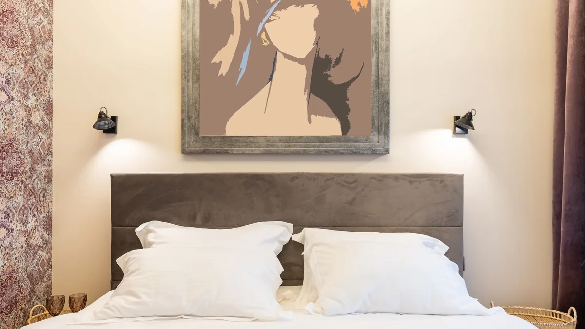
The chip looked like a soft greige in the store; on your bedroom wall it turns blue in the morning and muddy under the bedside lamp. Choosing from a chip under store lights, or from a photo of someone else’s bedroom, skips the thing that decides how a color looks: the light in your own room, which changes a paint’s intensity and cast with the direction it comes from. Below is the order to choose in: work out the light your bedroom gets, read the color’s LRV and undertone, pick a finish, shortlist example shades matched to that light, then test samples at the hours you use the room.
The short answer
| Your bedroom’s light | What it does to color | Start with | One maker’s examples (LRV) |
|---|---|---|---|
| North-facing: consistent, muted, cool | Brings out blue undertones | Whites with a hint of yellow, warm-undertone grays and neutrals; the light guide (a second maker’s) also suggests going darker | Cotton Balls (88.95), Wheeling Neutral (51.56), Kingsport Gray (25.05) |
| South-facing: strong, often warm | Makes colors look creamier | A white with a hint of gray or blue, a blue-toned gray, slightly darker hues; the light guide: soft, pale tones | White Diamond (83.37), Wickham Gray (67.87), Avon Green (20.99) |
| East-facing: direct in the morning, muted and cooler after noon | Changes a lot between morning and afternoon | Warm whites, light grays with a hint of warmth, mid-tones; the light guide: for evening use, light blues and greens | Simply White (89.52), Pale Oak (68.64), Gossamer Blue (55.04) |
| West-facing: muted in the morning, strong and amber after noon | Gives colors a warmer cast after noon | Cool-toned whites, grays and greiges; the light guide also offers warm tones | White Heron (86.69), Moonshine (66.53), Silvery Blue (61.28) |
| Mostly lamplight | Warm bulbs warm the wall, cool bulbs tend to cool it | Test at night under your own bulbs | Any of the above |
Which way does your bedroom face, and when are you in it?
Stand at the main window and check which way it looks out; a phone compass will do (our suggestion). Then match it to Benjamin Moore’s four direction guides, which say each kind of room tends to get:
- North: consistent light through the day, which can be muted and toned down, with a cool cast.
- South: consistent natural light through the day that tends to be strong and often casts a warmer tone.
- East: more direct light in the morning and more muted, indirect light past noon, with afternoon light that tends to have a cooler cast.
- West: indirect and somewhat muted light in the morning and stronger direct light past noon, which tends to have a warmer, amber cast.
Those descriptions are written for homes north of the equator; south of it, the north and south descriptions swap (our reading). Three more things change the same wall:
- The season. In north- and south-facing rooms, the same guides describe winter light as cooler and sharper, and summer light as able to give the same paint a warmer cast.
- What is outside. On the south-facing guide, a forest house with ample tree cover receives more muted light, while a desert house with a lot of natural light will be very bright.
- When you use the room. The east-facing guide sets a bedroom where you get dressed in the bright morning light against a room used mostly in the evening under artificial light. If you mostly see your bedroom first thing and at night, judge the color at both of those hours (our suggestion).
What does LRV tell you about a paint color?
LRV, light reflectance value, is the percentage of light a surface reflects, on a scale from 0 for absolute black to 100 for pure white; Benjamin Moore prints it under Color Information on its color pages. On that scale its Chantilly Lace sits at 90.04 and its Kendall Charcoal at 14.61.
What the number means in a room: on one maker’s color guide, light colors reflect more light and make a space feel bigger and more open, while dark colors absorb light and create a cozy, intimate atmosphere. Read it against the light you found above:
- A dim room has little light to bounce around, so a higher LRV gives back more of it (our reading).
- A bright south-facing room can take a lower one: the south-facing guide suggests colors with a lower brightness, and says slightly darker hues can help to prevent colors from washing out.
- LRV is brightness, not undertone. Cotton Balls (88.95) is a white with “a trace of yellow undertone” and Distant Gray (88.14) a white with “a hint of blue”, both in their maker’s words: less than one point apart (our arithmetic), leaning opposite ways. That is why the next step matters.
How do undertones change in north, south, east and west light?
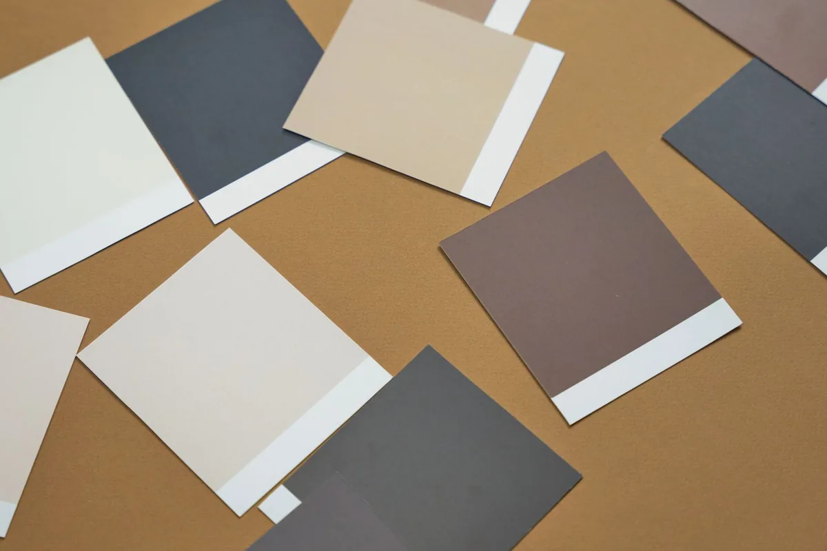
A mixed color has a mass tone, the color you see first, and an undertone. Warm colors typically have orange, yellow or red undertones and cool colors green, blue or purple ones (one maker’s undertone explainer). To see the undertone, hold the color next to a pure white, or look at the darker colors on the same strip, where it is easier to spot than in the pale ones at the top. Light pulls on it: blue northern light emphasizes blue undertones, and golden southern light makes colors appear creamier.
Benjamin Moore’s four direction guides (the direction guides, below) answer each light with the opposite undertone:
| Window faces | Whites | Grays | Neutrals |
|---|---|---|---|
| North | A hint of yellow | Warm undertones | Soft yellow undertones |
| South | A hint of gray or blue | Blue-toned | A touch of gray |
| East | Clean, warm whites | Lighter, with a hint of warmth | Warm undertones |
| West | Cool blue tones | Slightly cool-toned | Greige or neutral with cool undertones |
Balancing is one approach, not a rule: the undertone explainer calls balancing warm and cool elements in a room common advice, with no hard and fast rules. Farrow & Ball’s light guide (the light guide) sometimes works with the light instead:
- North. For lighter tones both lean warm: the light guide suggests yellow-based colors to bounce as much light as possible around the room, or a mirror to reflect it. The tension is blue: on the direction guide, cool, blue-gray tones are popular in north-facing rooms; on the light guide, if you use a lighter tone, avoid anything with a blue or gray base. For a darker, moodier look, the light guide offers darker wall colors that embrace the cool light for a cozy, cocooning feel; the direction guide’s warm-undertone grays, picked to soften northern light, go as deep as Kingsport Gray (LRV 25.05) for a moodier room.
- South. The light guide suggests soft, pale tones to maximize the feeling of light and space; the direction guide suggests lower brightness and says slightly darker hues can help keep colors from washing out.
- East. The direction guide balances with warm whites and warm-undertone neutrals. The light guide says it depends on when you use the room: mostly later in the day, light blues and greens that embrace the cooler evening light, or a deep, dark shade for a cocooning feel; during the day, bright, lively shades that make the most of the morning sun.
- West. The direction guide suggests cool-toned colors to even out the light. The light guide offers warm tones that make the most of the golden, late-afternoon light, or colors that look cool in the morning but balance the warmer light later.
Where they differ for your room, sample one of each kind (our suggestion).
Which paint finish should a bedroom have?
Sheen measures how much light a painted surface reflects, and different levels can affect how colors appear. On that maker’s chart of common uses, bedrooms appear under two finishes:
- Matte: walls, living rooms, dining rooms and bedrooms. Nearly as shine-free as flat, with slightly more durability; the same guide calls a matte look a luxurious touch in bedrooms.
- Eggshell: high-traffic walls, living rooms, dining rooms and bedrooms. It reflects more light than flat or matte and is easy to clean.
- Flat is listed for ceilings and walls in low-traffic spaces. Stains are harder to remove from low-sheen paint, and constant rubbing or cleaning can burnish it.
For trim, the direction guides suggest semi-gloss or high gloss to bring reflection to darker north- and east-facing rooms, and a lower sheen such as matte or eggshell on trim to tone down reflection in a sunny south-facing room. For trim and ceilings they name White Dove (LRV 83.16) in north-facing rooms and Chantilly Lace (90.04) in south-, east- and west-facing ones.
If a wall might get peel-and-stick wallpaper later, settle the sheen now. One wallpaper maker recommends eggshell, satin or semi-gloss, warns that flat, matte and low-sheen paint could come off when its paper is removed, and asks for at least 30 days after painting. Other papers set their own rules; our guide on how to install peel and stick wallpaper compares four makers.
Which shades suit each light level?
This is your shortlist for the testing step below. The colors in the four tables, the follow-up lines and the two-window trios are all Benjamin Moore colors from its four direction guides. Each table row gives the LRV from the color’s page and its undertone or tone in that page’s own words; the “Listed as” column is the guide’s own group. They are starting points to test, not our picks.
North-facing: muted, cool light
| Color | LRV | Undertone or tone (color page) | Listed as |
|---|---|---|---|
| Cotton Balls OC-122 | 88.95 | “a trace of yellow undertone” | White |
| White Chocolate OC-127 | 86.83 | “Soft cream notes” | White |
| Wheeling Neutral HC-92 | 51.56 | “A powdery beige” | Neutral |
| Kingsport Gray HC-86 | 25.05 | “A versatile taupe” | Gray |
The guide’s own top picks for north light are sunny yellows, peachy pinks and orange-tinged hues: Weston Flax HC-5 (LRV 76.45), Head Over Heels AF-250 (73.32) and Satchel AF-240 (11.8).
South-facing: strong, warm light
| Color | LRV | Undertone or tone (color page) | Listed as |
|---|---|---|---|
| White Diamond OC-61 | 83.37 | “a hint of blue” | White |
| Decorator’s White OC-149 | 82.68 | “A touch of cool gray” | White |
| Wickham Gray HC-171 | 67.87 | “blue-gray” | Gray |
| Yarmouth Blue HC-150 | 55.82 | “A classic airy blue” | Top pick |
| Avon Green HC-126 | 20.99 | “earthy green shaded with hushed gray tones” | Top pick |
For a moodier south-facing bedroom, the same guide names darker colors such as Evening Dove 2128-30 (LRV 12.02), since a south-facing room gets more light.
East-facing: bright mornings, cooler afternoons
| Color | LRV | Undertone or tone (color page) | Listed as |
|---|---|---|---|
| Simply White OC-117 | 89.52 | “The slightest hint of warmth” | White |
| Pale Oak OC-20 | 68.64 | “warm gray undertones” | Gray |
| Shaker Beige HC-45 | 53.53 | “beige neutral” | Neutral |
| Gossamer Blue 2123-40 | 55.04 | “balance of gray, blue and green tones” | Top pick |
The guide’s top picks are mid-tones, which can balance the bright morning light and bring depth to muted afternoons.
West-facing: muted mornings, warm afternoons
| Color | LRV | Undertone or tone (color page) | Listed as |
|---|---|---|---|
| White Heron OC-57 | 86.69 | “the slightest cool cast” | White |
| Moonshine OC-56 | 66.53 | “Muted blue, green, and gray undertones” | Gray |
| Hazy Skies OC-48 | 58 | “A putty gray-green” | Neutral |
| Silvery Blue 1647 | 61.28 | “a hint of silver” | Top pick |
Windows on two sides
Each of the four guides also names three colors its experts recommend for flexibility across exposures, and the trio is different on every page (LRVs from each color’s page):
- North-facing guide: Swiss Coffee OC-45 (81.91), Gray Owl OC-52 (64.51), Bleeker Beige HC-80 (51.66).
- South-facing guide: Steam AF-15 (84.2), Kendall Charcoal HC-166 (14.61), Hush AF-95 (57.09).
- East-facing guide: Super White OC-152 (87.36), Stonington Gray HC-170 (59.36), Ballet White OC-9 (71.97).
- West-facing guide: White Dove OC-17 (83.16), Metropolitan AF-690 (49.96), Revere Pewter HC-172 (55.05).
In a corner bedroom, sample one color from each window’s table next to one of these (our suggestion).
If restful is the brief
Soft blues, gentle greens and cool neutrals are Sherwin-Williams’ bedroom-guide answer for a calming, restful vibe, and Benjamin Moore’s relaxing bedroom colors page includes Palest Pistachio 2122-60 (LRV 83.84; “A barely-there hue with crisp notes of blue.” on its color page) and, at its darkest, Black Pepper 2130-40 (21.12), a blue-gray it calls “deep and enveloping.” So restful does not have to mean pale (our reading). What the makers say about calm in each light:
- East, used in the evening: the light guide finds light blues and greens that embrace the cooler evening light can have a soft and calming effect; it gives a deep, dark shade as the cocooning alternative. For a named color, the direction guide suggests Ocean Air 2123-50 (LRV 71.84) as a lighter, airier color for an east-facing wall, and its color page calls it “A go-to blue-green for creating instantly soothing spaces.”
- South: the light guide’s blues create a calming, aquatic feel. The direction guide’s south top picks, such as Yarmouth Blue (55.82), are greens, blues and violets it gives for balancing the warm light, not for calm.
- West: the direction guide says cooler hues can bring a softness to the room as the light becomes more direct later in the day, as with Silvery Blue (61.28), which its color page says “offers calming serenity.”
- North: here restful and right pull apart. Blue northern light emphasizes blue undertones, and the light guide says to avoid blue or gray bases in lighter tones, so a pale blue tends to read cooler (our reading). Neither guide names a calm color for north light; instead of a pale blue they offer a warm-undertone neutral (the direction guide, for a warm ambience) or a darker color for a cocooning feel (the light guide).
How do you test paint samples in a bedroom?
- Look at chips of your shortlist first. Hold a chip up against the wall rather than looking down at it, and put a white sheet of paper behind it so your current wall color doesn’t sway it (one maker’s sampling tips).
- Keep two to four candidates, including near neighbors (our suggestion on the number). Even very similar chips can differ a lot in undertone, so once you have one or two colors, try a few varieties of each.
- Buy samples big enough to judge. A Benjamin Moore Paint Color Sample is an 8 oz jar of eggshell that covers about a 2 by 2 foot area at two coats: $5.99 at 11 October 2026 prices (price for reference only). Its Peel and Stick Paint Sample is one reusable 9 by 14.75 inch sheet made by Samplize with that maker’s paint, sold online: $6.95 at 11 October 2026 prices (price for reference only). A jar covers about 4 square feet and a sheet about 0.92, so more than four times the area (our arithmetic). For a jar you can also pick up a white foam board to paint on. Both samples come in eggshell; if you chose matte, the wall will reflect a little less light than the patch (our reading from the sheen guide). The liquid samples are for testing color only; they lack the performance components of Benjamin Moore’s regular paint and may shift or fade sooner, so don’t finish a wall with them.
- For liquid samples, paint two coats, as large as you reasonably can. Brush straight onto the wall if it is white or a light neutral; otherwise paint the white foam board so you can move it around.
- Put samples where the light differs: on the wall facing the window and on the darkest wall (our suggestion). One jar paints one patch, so either buy two jars per color, paint a foam board and move it between the walls, or move a peel-and-stick sheet, which can also wrap around a corner to show the color in light and shadow at once.
- Let them dry before judging. Some colors look much the same wet and dry, some quite different; on another maker’s color tips, dry paint always looks darker than wet.
- Leave them up for a couple of days and look at them through the day. For a bedroom, look as you get up, in the afternoon, and at night with the bedside lamps on (our suggestion).
- Check the bulbs. Halogen and incandescent bulbs give yellow light that warms a wall, cool white bulbs tend to give a cooler cast, and a neutral white bulb most accurately replicates daylight. If a color looks wrong only at night, changing the bulbs is an alternative to changing the color.
For the walls themselves, our weekend home improvement projects have the painting steps: about 2 gallons for two coats in a 12 by 12 foot room with 8 foot walls, at that guide’s example paint coverage.
Where these numbers come from
LRVs and color descriptions come from each color’s page on Benjamin Moore’s site, the direction advice from its four color-by-direction guides, and the sheen, undertone, sampling and lighting advice from the paint and wallpaper makers’ pages linked above, all read on 11 October 2026. Sample prices are from its product pages on the same day. The LRV gap, the sample-area comparison and the paint-per-room figure are our arithmetic or the linked guide’s.
Frequently asked questions
What is the best paint color for a north-facing bedroom?
Benjamin Moore's north-facing guide balances the cool, muted light with whites that have a hint of yellow, grays with warm undertones and neutrals with soft yellow undertones, such as Cotton Balls (LRV 88.95) or Wheeling Neutral (LRV 51.56); its warm grays go as deep as Kingsport Gray (LRV 25.05). Farrow & Ball's light guide says to avoid blue or gray bases in lighter tones, and also suggests embracing the cool light with darker colors. Sample two to four colors in the room before you buy gallons.
What does LRV mean on a paint color?
Light reflectance value: the percentage of light a painted surface reflects, from 0 for absolute black to 100 for pure white. A higher LRV gives back more of the light a room gets (our reading); it tells you nothing about the undertone, so two whites less than one point apart can lean yellow and blue.
What paint finish is best for bedroom walls?
On one paint maker's sheen chart, bedrooms are listed under matte and under eggshell; flat is listed for ceilings and low-traffic walls, and stains are harder to remove from low-sheen paint. Eggshell reflects a little more light than matte and is easy to clean. If you might put peel-and-stick wallpaper on a wall later, check the paper first: one maker recommends eggshell, satin or semi-gloss and warns that flat, matte and low-sheen paint could come off with its paper.
How long should I look at paint samples before choosing a bedroom color?
Let them dry completely first; on one maker's tips, dry paint always looks darker than wet. Then leave them up for a couple of days and look at them in the morning, in the afternoon and at night under your own lamps (our suggestion).
What colors make a bedroom feel relaxing?
Sherwin-Williams' bedroom guide names soft blues, gentle greens and cool neutrals for a calming, restful vibe, and Benjamin Moore's relaxing-bedroom page includes a deep blue-gray, so restful does not have to mean pale (our reading). Match it to your light: Farrow & Ball's light guide says light blues and greens can have a calming effect in an east-facing room used in the evening, and that blues create a calming feel in a south-facing one; Benjamin Moore's west guide says cooler hues can bring softness as the afternoon light gets stronger. In north light a pale blue tends to read cooler (our reading); neither guide names a calm color for north light, and instead they offer a warm-undertone neutral (Benjamin Moore) or a darker color for a cocooning feel (Farrow & Ball).
- #bedroom paint colors
- #paint colors
- #LRV
- #paint sheen