Best Colors for Living Room Walls: Start With What Stays
Pick a living room paint color around the floor, sofa and rug you keep, the rooms you see from the sofa and the light, with eight example shades to sample.
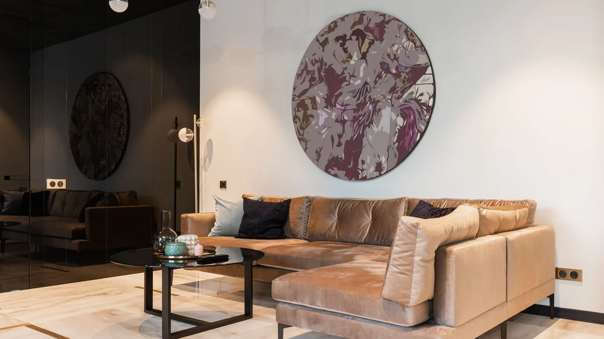
The chip looked right on the store display; beside your own sofa and floor it looks off, and by the time the lamps are on it has turned into another color. Choosing from a color name, or from a photo of someone else’s living room, skips what your room has already decided: the floor, sofa and rug you are keeping, the rooms you can see through the doorways, and the light. Below is the order to choose in, ending with a shortlist of two to four shades to test and a plan for where each goes.
The short answer
| If you are keeping | Start with | Whose guidance |
|---|---|---|
| A dark floor | Light walls such as off-white or pastels | One maker’s flooring guide |
| A light floor | Dark walls (charcoal, indigo, forest green), or a light wall in a different color with the same type of undertone | The same flooring guide |
| A warm-undertone floor (red, orange or yellow bases) | Creamy whites, beiges, earthy tones | The same flooring guide |
| A cool-undertone floor (blue, green or true gray bases) | Cool whites, soft grays, muted sages | The same flooring guide |
| A sofa or rug in a color you like | An accent wall tied to its fabric; the other walls a lighter version of it or a neutral that complements | Benjamin Moore’s living room guide |
| Rooms that open onto each other | One palette across them and one trim color throughout | Two makers’ open-concept guides |
| Where each color goes | Your tested color on the main walls; the sofa or rug echo on one optional accent wall; one white trim and baseboard color; the ceiling lighter than the walls or neutral, or, as the alternative, color overhead and on the baseboards over neutral walls | The open-concept, flooring and living room guides above |
What are you keeping, and what does it ask of the wall?
List what is not changing: the floor, the sofa, the rug, a fireplace, wood window frames and doors (our suggestion). Those set the terms. Benjamin Moore’s whole-house palette page starts in the same place: consider existing furniture, flooring, cabinets and countertops, then decide whether a warm or a cool undertone suits the room, based on the direction it faces and how much natural and artificial light it gets.
The floor. One maker’s flooring guide sorts floors by undertone: warmer undertones are red, orange or yellow bases and pair with creamy whites, beiges and earthy tones; cool undertones are blue, green or true gray bases and pair with cool whites, soft grays and muted sages. In general it pairs warm wall colors with similar floors and cool with cool, and gives an icy gray wall against a golden yellow floor as the clash, adding that the same gray would pair well with a deep brown floor with cool undertones. To read your floor, lay a bright white paper on it and blur your eyes, or take an out-of-focus phone photo; the guide says the undertones should jump out.
Light or dark against the floor. On that flooring guide, dark floors with light walls such as off-white or pastels keep a room open, airy and bright, and light floors with dark walls such as charcoal, indigo or forest green make it dramatic or cozy. Light on light can work if the wall is a different paint color from the floor with the same type of undertone, for a modern, minimalist or Scandinavian effect. In a small or dark room, the advice is dark floors or dark walls, not both, or the room can feel cave-like; instead it suggests pairing light floors with bright white or creams to reflect the light you have.
The sofa and rug. One maker’s accent-color guide suggests basing a scheme on a fabric coming into the room, such as curtains, upholstery or throw pillows, or on a favorite print or painting. On Benjamin Moore’s living room guide, an accent wall takes a hue tied to the fabrics, area rugs and accessories, with the remaining walls a lighter version of it or a neutral with a complementary undertone; and where the carpet, flooring and fabrics are mostly neutral, a soft green such as October Mist can add dimension and interest.
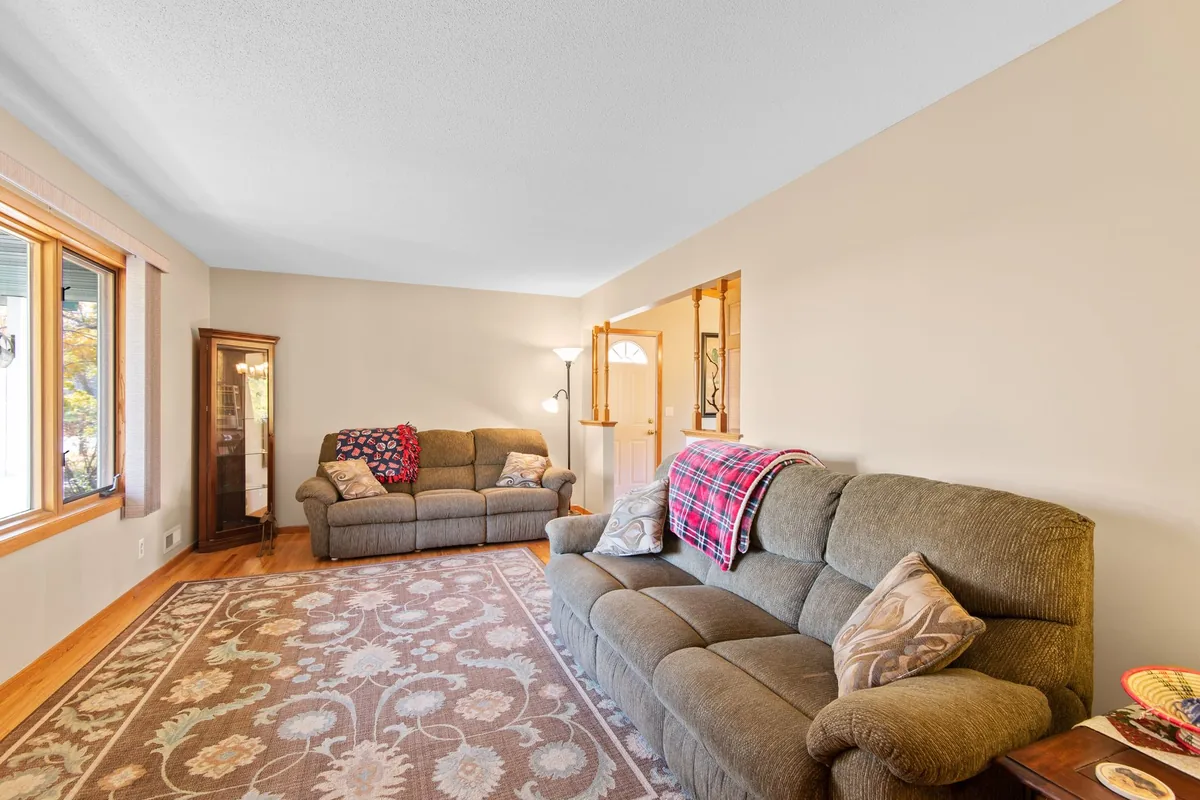
Write down three things before moving on (our suggestion): whether the floor reads warm or cool, whether it is light or dark, and the one color in the sofa or rug you would like the wall to echo. That is the brief for the shade table below.
What can you see from the sofa?
Sit where you sit most and note every wall and doorway in view (our suggestion). If those rooms connect, the wall color has to work as one view. Benjamin Moore’s living room guide says living and family rooms are often the central space, connected or open to other areas, and that a neutral living room color can help connect adjoining spaces and create color flow. Its whole-house page begins with a dominant color in the central room, names a living room with a unique fireplace as one example, and then adds secondary colors for the other living spaces.
Two ways to paint an open plan, from one maker’s open-concept guide: one color, or very similar shades, throughout, which it says works best for small spaces and minimalist homes; or different shades from the same color family for nearby areas, which it says gives subtle variation without harsh changes. A second maker’s guide suggests three shades from one family (dark, medium and light), changing color at the corners where two walls meet, and using the same sheen on all the walls.
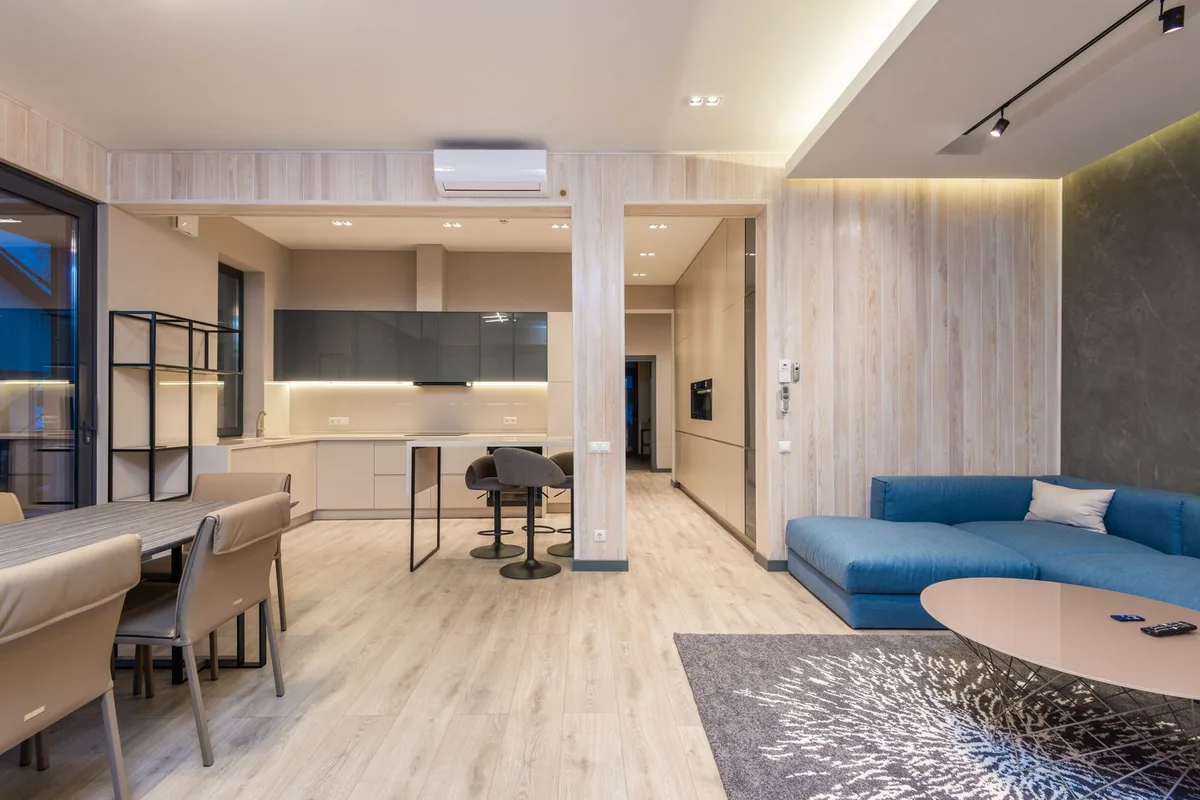
If you want one wall to stand out, the second maker says the far wall usually works for it, and the first says an accent wall in an open living room adds interest without overwhelming the space, and is better if you can see it from different angles. The wall you face from the sofa and also see from the next room fits both (our reading). Where the sofa and rug go is a separate question; our living room decor ideas cover layout.
How much color should the room carry?
The accent-color guide’s rule of thumb is 60/30/10: 60% of the room in the main color, 30% in the main accent color and the last 10% in a secondary accent color, and it says to play with the ratios as you like. In its own bedroom example the main color is on the walls, ceiling and bedding, and the accent color, white, is in the curtains, trim, doors and bedding. So the ratio counts everything in the room, not only paint, and in a living room the sofa, rug and floor take part in the count (our reading).
- Accent wall. For a black one, Benjamin Moore’s Hannah Yeo says, “Keep the other elements in the space, like floors and furniture, light for the ultimate effect.” With a dark sofa or floor, a lighter accent is the safer start (our reading).
How will the color look from morning to lamp time?
Benjamin Moore’s living room guide says the amount of light a room gets and the direction it faces have a direct impact on how a color appears. A room flooded with sunlight can handle more saturated color but pale shades tend to get washed out; cool colors counter strong sunlight, while north-facing rooms get cozier wrapped in a warm color; and for a south- or west-facing room it suggests leaning cooler. At the dim end, the flooring guide says lower light makes neutral paint look darker and less saturated, even muddy, and Sherwin-Williams’ living room page suggests a bright, warm white such as Dover White to brighten a dimly lit space.
Whether you sit in your living room mostly by day or by lamp changes the answer, so work out which it is. For east- and west-facing rooms one maker’s orientation guide says to choose a color based on when you plan to use the space the most; if that is after dark, judge the color by lamplight first (our reading). Window direction, LRV and bulb temperature are worked through in our best bedroom colors guide, and they apply here as they do there.
Which shades should you sample first?
Starting points, not our picks: eight Benjamin Moore colors named in its living room guide, with each LRV from the color’s own page and the page’s opening line. “Listed as” is where the guide names it. The Band column is our own cut of the LRV column: light above 70, mid 45 to 70, deep under 25 (our reading).
| Color | LRV | Band (ours) | Color page says | Listed as |
|---|---|---|---|---|
| White Dove OC-17 | 83.16 | Light | “clean and classic white” | Favorite neutral; popular-color answer |
| Classic Gray OC-23 | 73.67 | Light | “An ultra-light shade of gray that can also function as an off-white” | Greige; popular-color answer |
| Revere Pewter HC-172 | 55.05 | Mid | “a versatile bridge between warm and cool tones” | Minimalist neutral; popular-color answer |
| Gossamer Blue 2123-40 | 55.04 | Mid | “balance of gray, blue and green tones” | Vivid color in its video room |
| October Mist 1495 | 46.54 | Mid | “gently shaded sage” | Light green |
| Stardust 2108-40 | 24.11 | Deep | “reveals depths of gray and brown” | Favorite neutral |
| Iron Gate 1545 | 23.1 | Deep | “the slightest trace of brown undertone” | Cozy: deep neutral |
| Regent Green 2136-20 | 6.16 | Deep | “A deep pine green that verges on black” | Cozy: muted pine |
Read the table against your brief. The light band is the end that matches the flooring guide’s advice for a dark floor (off-white or pastels), and the deep band the end that matches its advice for a light floor (charcoal, indigo or forest green); that mapping is ours (our reading), and the guide’s small-room warning about dark floors plus dark walls still applies. If you cannot tell whether the floor reads warm or cool, a color whose own page calls it a bridge between warm and cool is a fair thing to put on the shortlist (our suggestion). The October Mist row is the one for a room whose floor and fabrics are mostly neutral. Sherwin-Williams’ living room page names Anonymous, a deep brown neutral, and Sweater Weather, a warm green-gray, for cozy, and Charcoal Blue, a deep gray-toned navy, for a relaxing, subdued mood.
Pick two to four (our suggestion): one that fits your floor’s contrast, one that echoes the sofa or rug, and a near neighbor of the first.
Which finish, and how do you test it next to the sofa?
On Benjamin Moore’s chart of common uses, living rooms appear under matte (walls, living rooms, dining rooms and bedrooms) and eggshell (high-traffic walls, living rooms, dining rooms and bedrooms); satin is listed for high-traffic walls and trim, and semi-gloss for trim, doors and cabinets. Its living room guide suggests matte to ease the reflections in a room with strong natural light, or for a soft effect where natural light is minimal. The full chart and sample sizes are in our best bedroom colors guide, so here is the part that is different for a living room:
- Cut the shortlist to two to four and get samples big enough to judge. Benjamin Moore sells 8 oz brush-on color samples, 4 by 8 inch swatches online only, and reusable, movable peel-and-stick samples.
- Put them beside what stays (our suggestion): next to the sofa arm at seat height, low on the wall where it meets the floor, and on the wall you see from the next room.
- Look at them from morning to evening, in natural and artificial light, as Benjamin Moore advises, and once with the lamps on from the sofa seat (our suggestion).
- In an open plan, stand in the next room and look back at the samples beside the neighboring wall and trim colors (our suggestion).
- Choose the one that still looks right beside the floor and the fabric at the hour you use the room most, then use the same sheen on every wall of the connected space, as the second maker’s open-concept guide advises. The last step puts each color on a surface.
Where does each color go?
With the color chosen, give each surface its job:
- Main walls: the color that won the test.
- Accent wall (optional): the shade that echoes the sofa or rug, on the wall you face from the sofa and also see from the next room (our reading, from the two accent-wall lines above). Benjamin Moore’s living room guide keeps the remaining walls a lighter version of the accent or a neutral with a complementary undertone.
- Trim and baseboards: one trim color across connected rooms. The open-concept guide says one trim color ties the wall colors together and that white trim works with almost any wall color, and the second maker’s guide says trim and woodwork should be white. Where walls and floor are very similar, the flooring guide says crisp white or off-white baseboards keep them from bleeding into each other.
- Ceiling, which is a choice. Default: lighter than the walls, which the open-concept guide says makes it feel higher and the space bigger (it adds that a darker ceiling can make large areas feel cozier), or neutral, as the second maker’s guide says. Alternative: Benjamin Moore’s living room guide says to “Pair richly hued painted ceilings and baseboard trim with neutral walls”. Its baseboards are colored too, which is different from the white trim in step 3, so pick one route and do not mix them (our suggestion).
Where these numbers come from
LRVs and color descriptions are from each color’s page on Benjamin Moore’s site; the flooring, open-concept, accent, ceiling, trim and finish advice is from the Benjamin Moore, Sherwin-Williams and Glidden pages linked above, all read on 27 October 2026. The light, mid and deep LRV bands and every line marked as our reading or suggestion are ours.
Frequently asked questions
What wall color goes with a wood floor?
On one maker's flooring guide, warm-undertone floors (red, orange or yellow bases) pair with creamy whites, beiges and earthy tones, and cool-undertone floors (blue, green or true gray bases) with cool whites, soft grays and muted sages. The same guide says dark floors suit light walls such as off-white or pastels, and light floors can take dark walls such as charcoal, indigo or forest green. It says that in general warm walls go with warm-undertone floors and cool walls with cool.
Should I paint one accent wall in the living room?
Benjamin Moore's living room guide says that if you do, pick a hue that ties to the fabrics, rugs and accessories in the room, and paint the remaining walls a lighter version of it or a neutral with a complementary undertone. In an open plan, one maker's guide says an accent wall can add interest without overwhelming the space and works better if you can see it from different angles, and another maker's guide says the far wall usually works. A wall you face from the sofa and also see from the next room fits both (our reading).
What paint finish should living room walls have?
On Benjamin Moore's chart of common uses, living rooms are listed under both matte and eggshell. Its living room guide suggests matte to ease reflections in a room with strong natural light, or for a soft effect in a room where natural light is minimal.
What is the 60-30-10 rule for room colors?
One maker's accent-color guide puts it as 60% of the room in the main color, 30% in the main accent color and the last 10% in a secondary accent color, and says you can play with the ratios. In its own bedroom example the main color covers the walls, ceiling and bedding, so it counts everything in the room, not only the paint.
- #living room paint colors
- #paint colors
- #color flow
- #accent wall